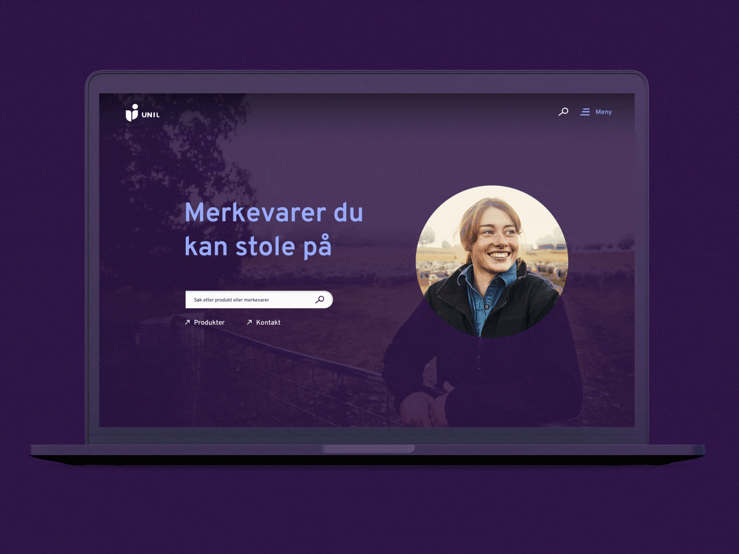
Visual identity and logo
Client: Unil+, NorgesGruppen
Agency: Kikkut kommunikasjon
My role: Lead designer, visual identity
Year: 2022
About
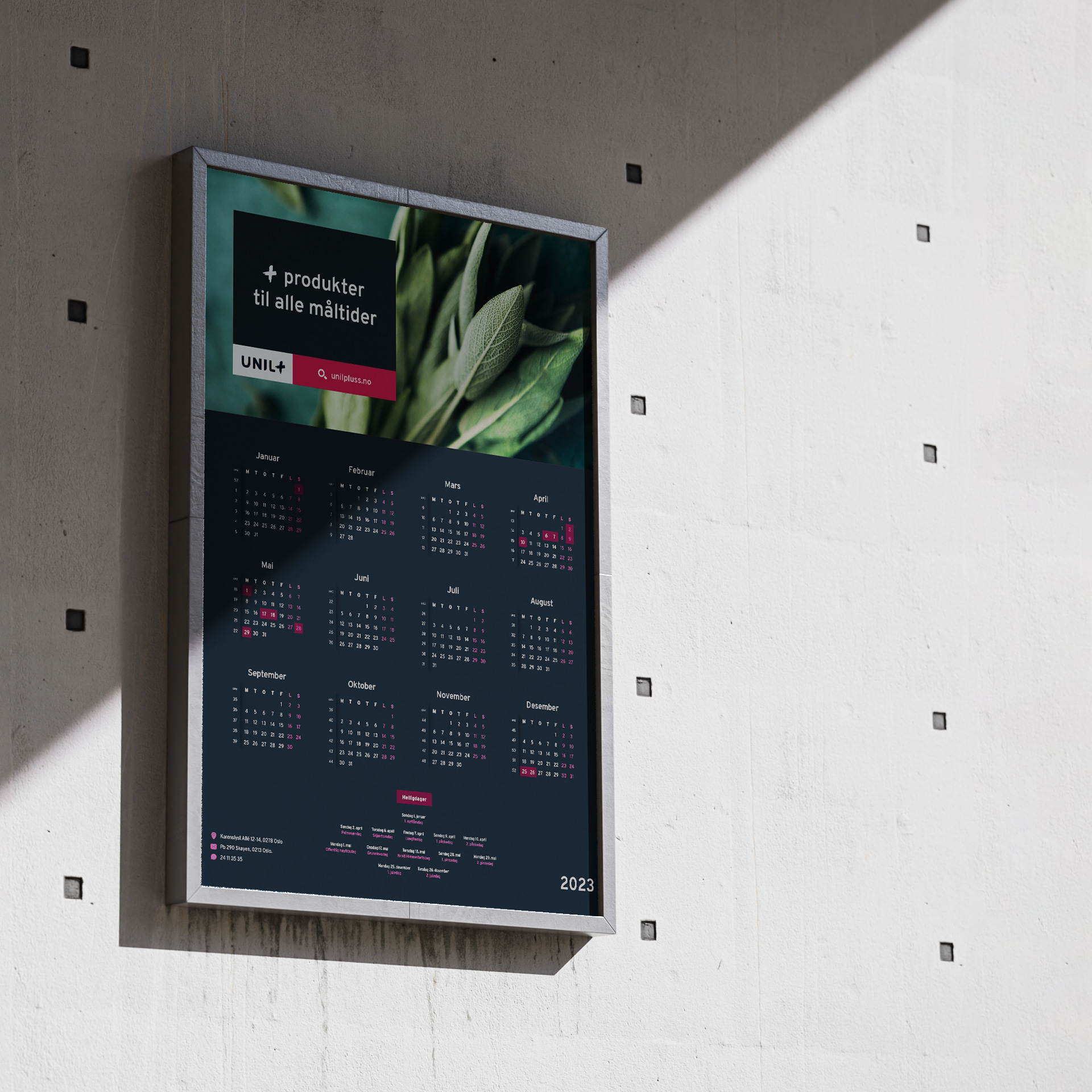
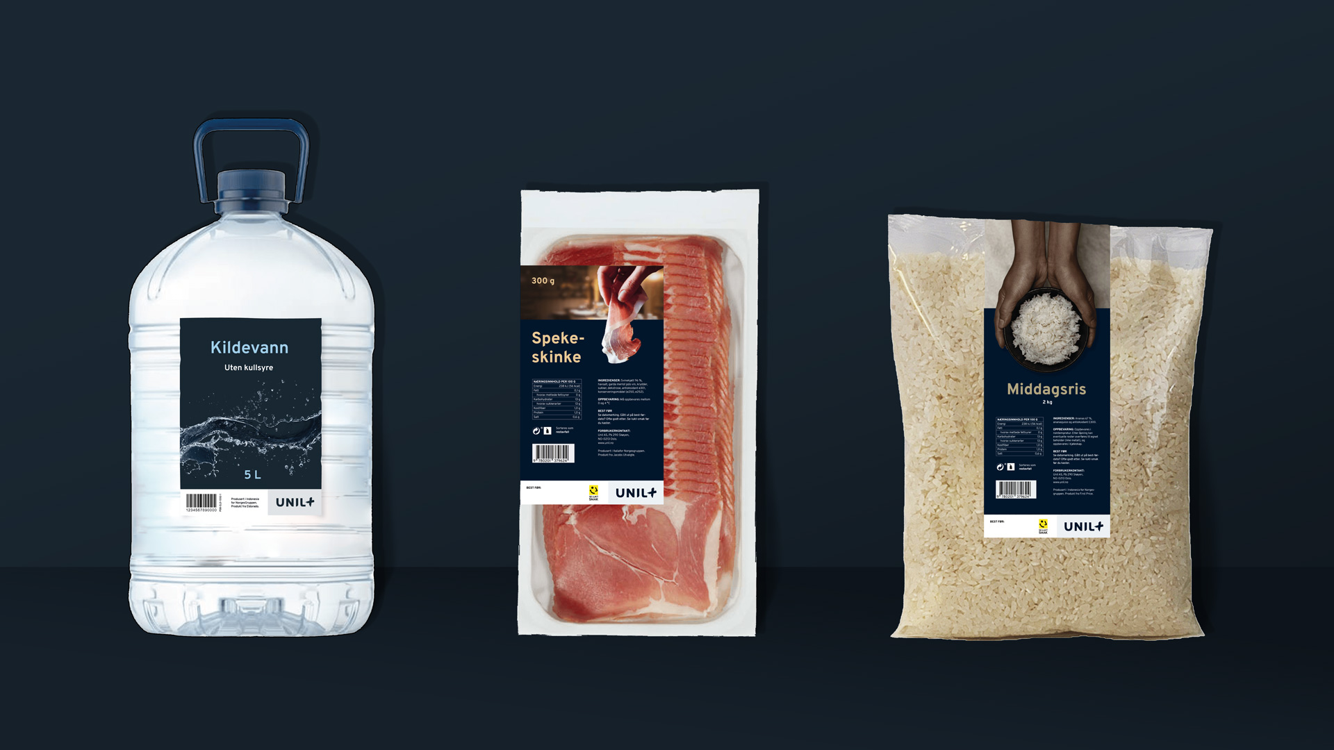
Unil+ offers the industry's largest food selection to catering kitchens of all sizes. They focus on knowledge of the market, the quality of the products and understanding of the customer's target groups. The plus sign in the logo symbolizes added performance, added delivery and added created value for the customers.
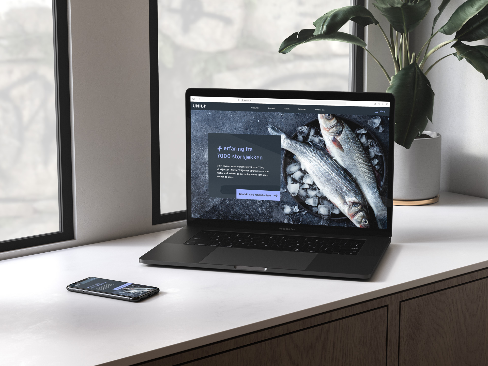
Concept
Unil+ combines raw materials from different brands, suppliers and locations, in order to provide a complete offer to customers. This is reflected in a layout system where several square shapes are fused together to give a complete message: Like building blocks.
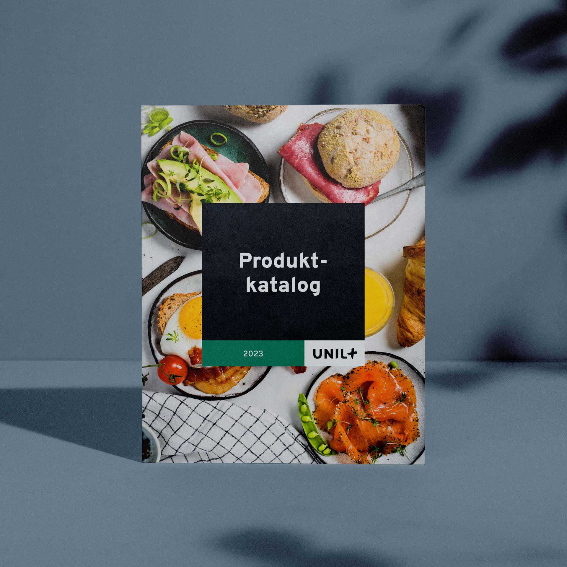
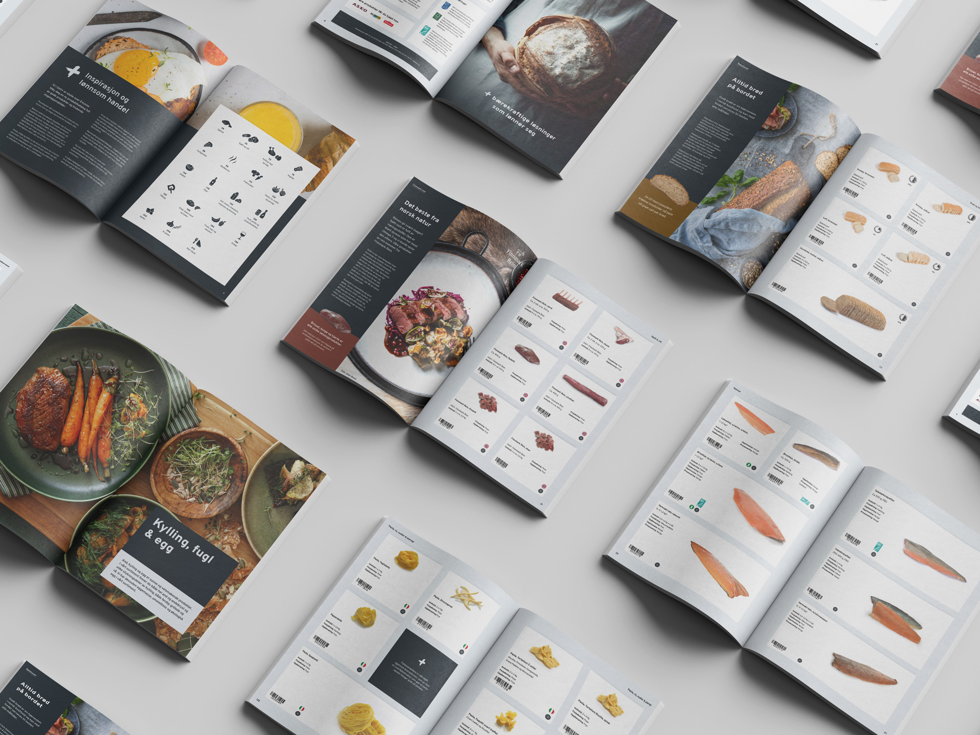
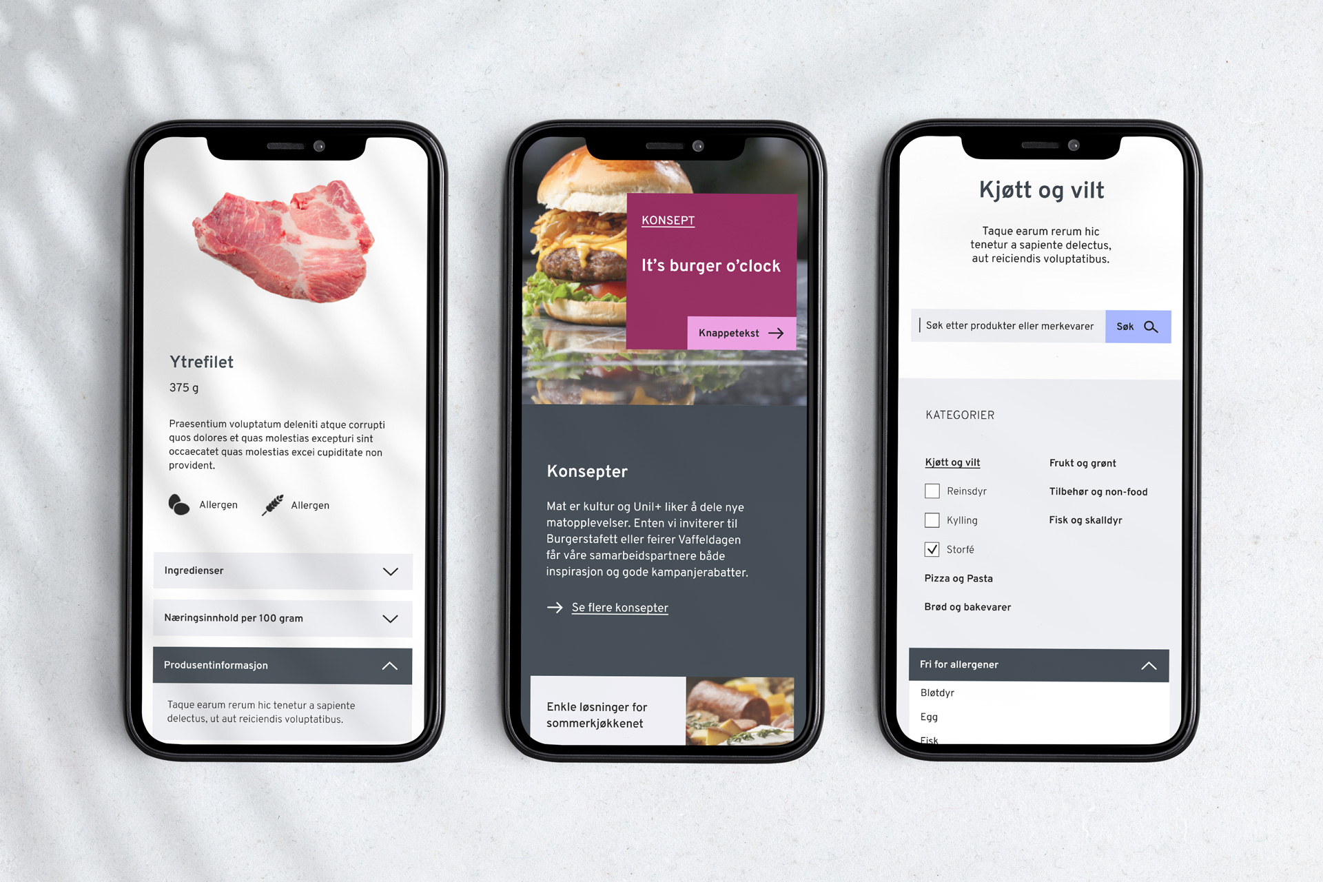
Image by rawpixel.com on Freepik
Selected Works
Visual identity for Vår kommunikasjonGraphic Design
Self PortraitIllustrations
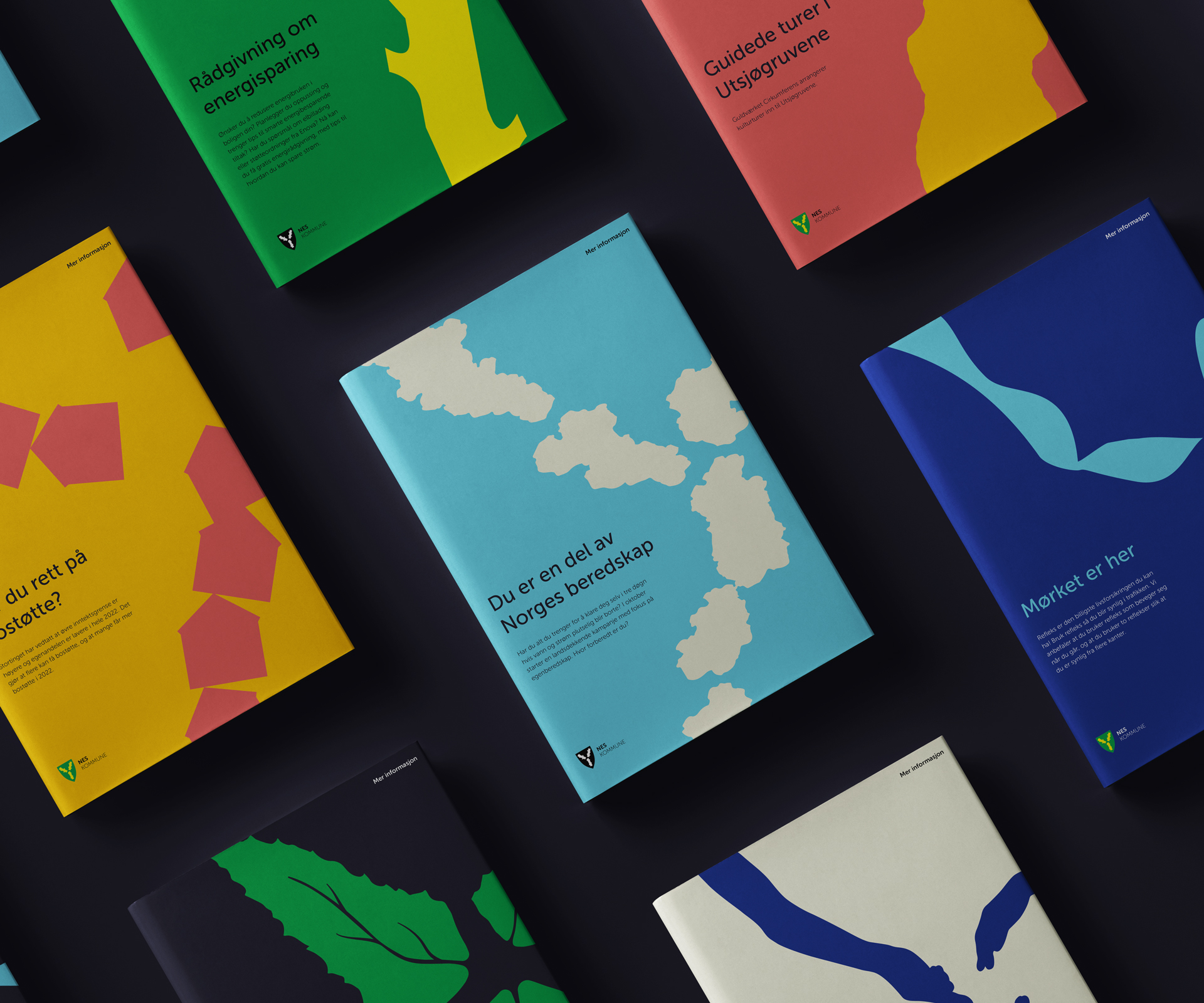
Nes municipalityGraphic design
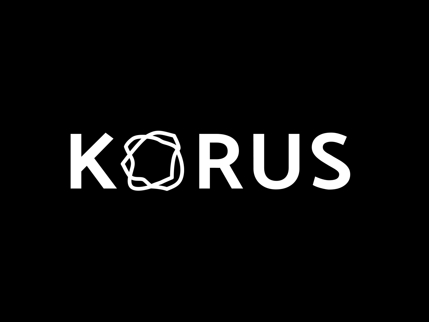
Visual identity for KORUSGraphic design
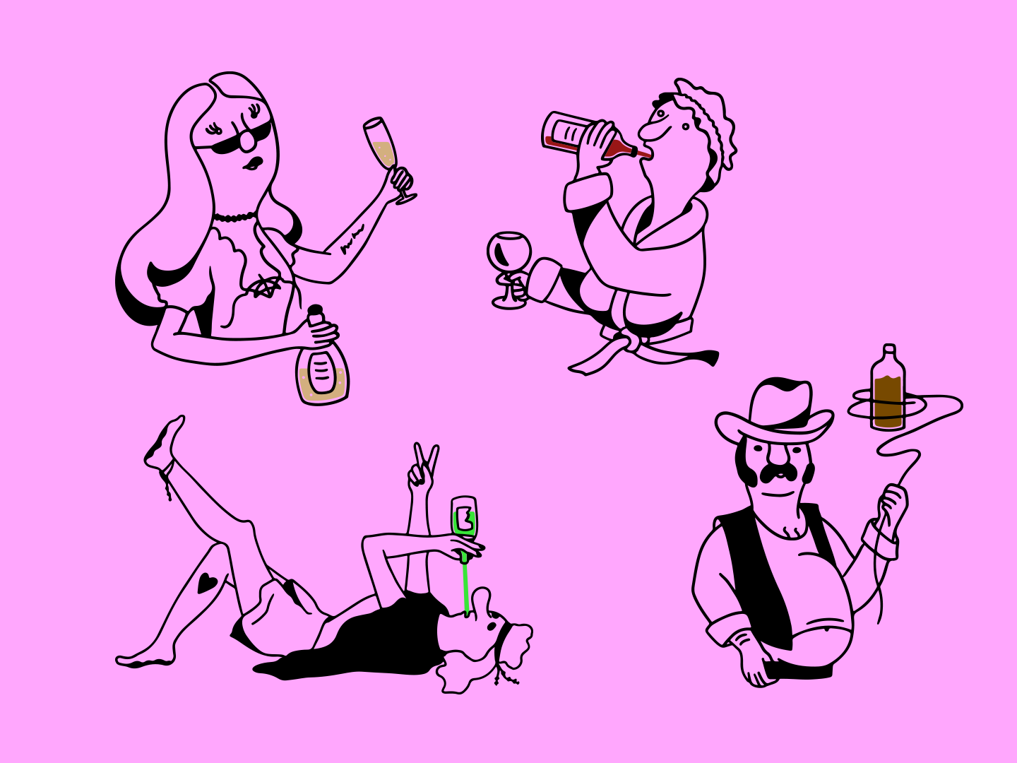
ThirstyIllustrations
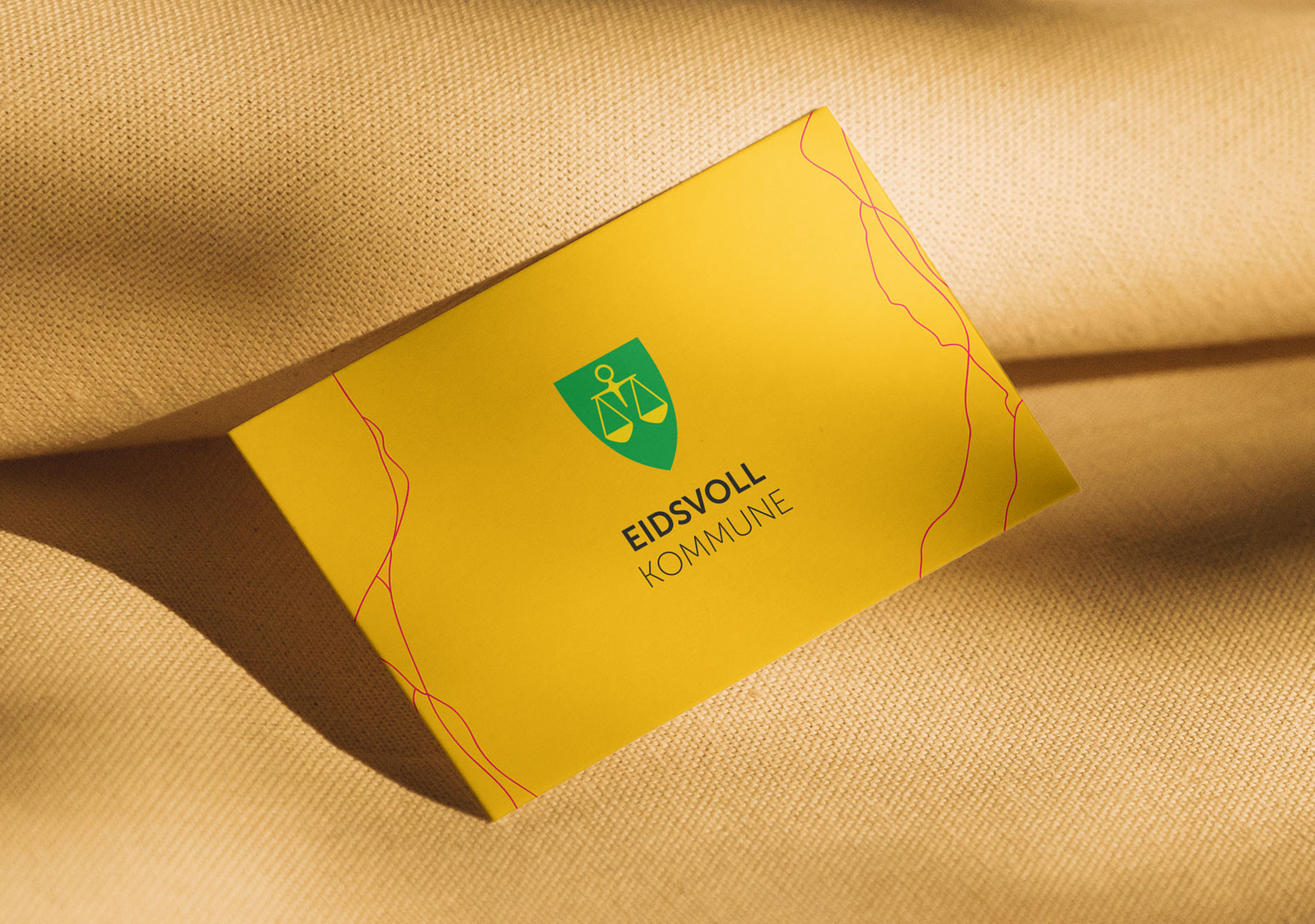
Eidsvoll municipalityGraphic design
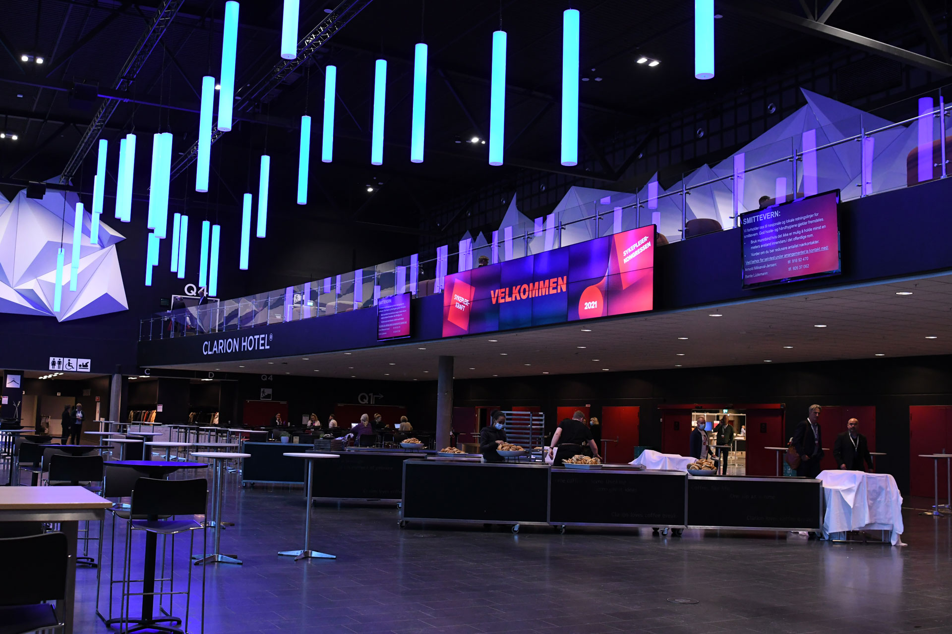
Visual identity for SykepleierkongressenGraphic Design
Visual identity for Unil merkevarehusGraphic Design

Venus and MarsIllustrations

All children have the right to a safe upbringingIllustrations
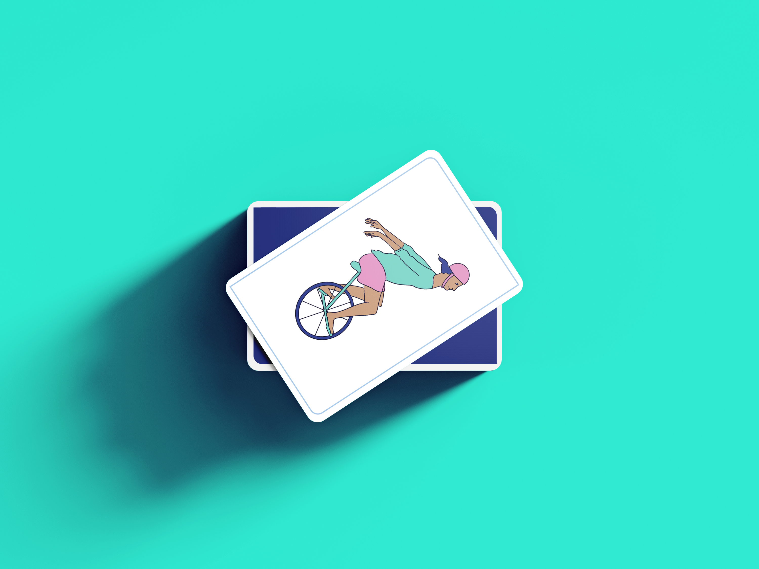
Value cards for children and adolescentsIllustrations